I've started off making a very basic page of what my website is about and another second page to start off for so far. I don’t want to keep going without being able to remember my start points so I'll be using this page to track my progress from a basic level to a (hopefully) advanced one.
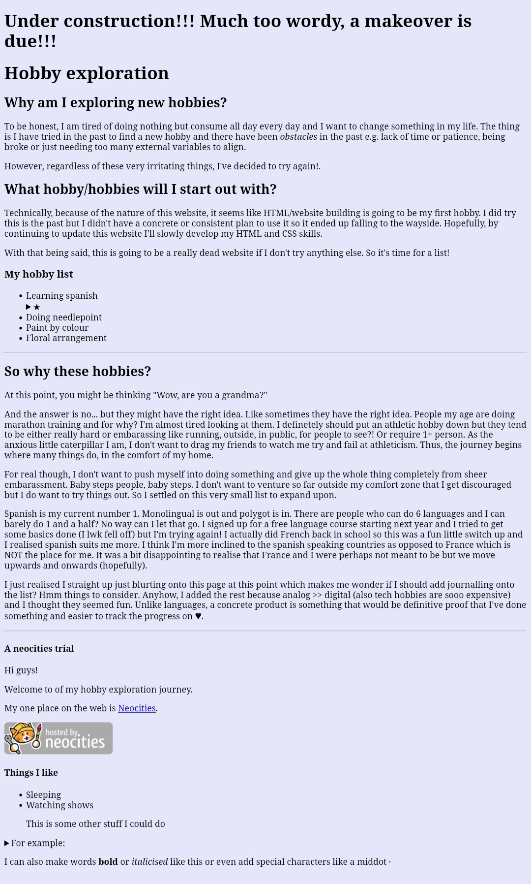
Day 1 was the start of it all. I made the base of the website and played around with text and applied what I learnt from W3 school. I basically blurted out my thoughts with 0 regard and did whatever.
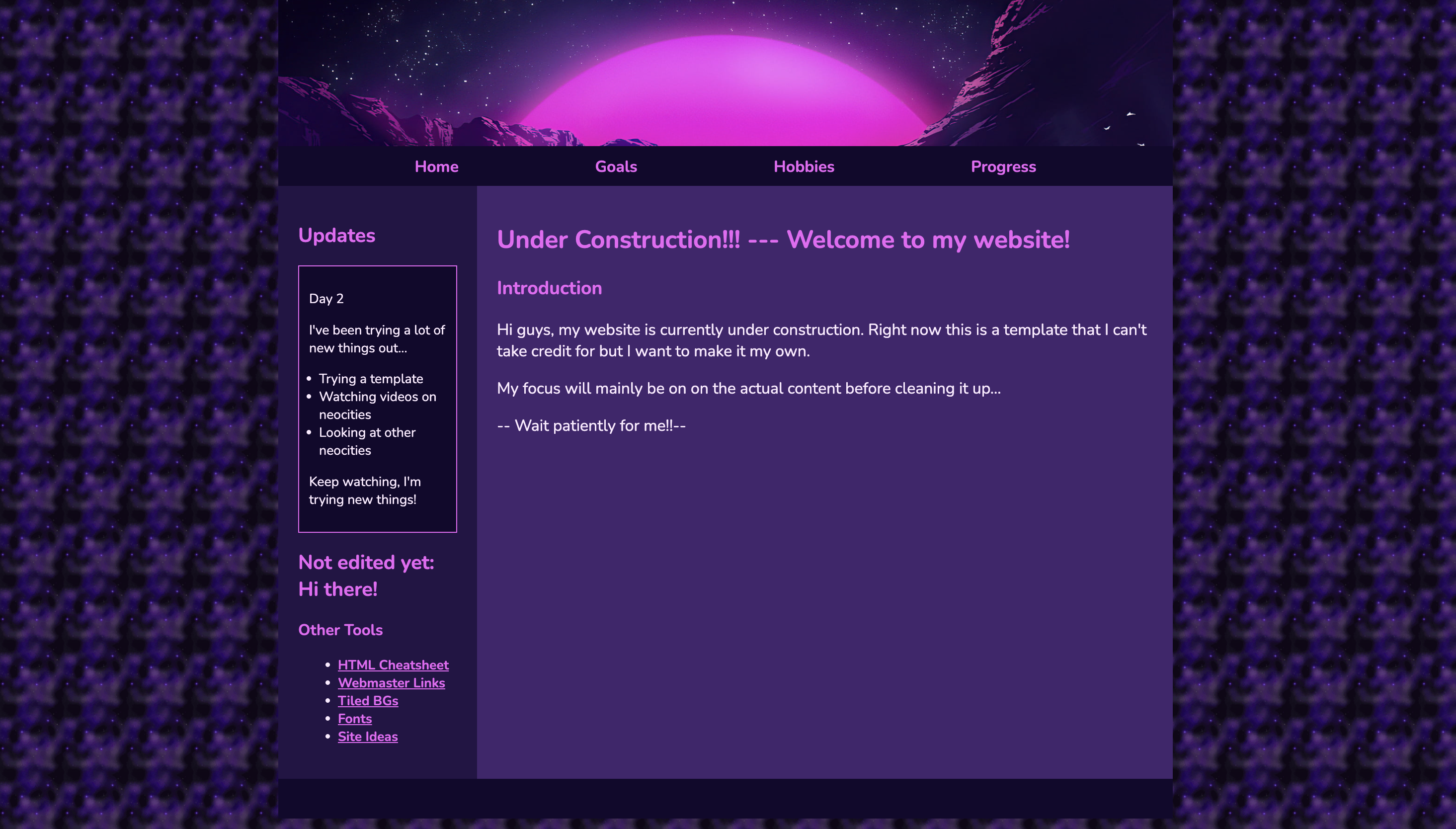
I tried a new template, looked at videos on making neocities and figured out how to make the links on the navigation work. Another thing I learnt was how to order my files. Finally some organisation.
Now take a look at my new index page!
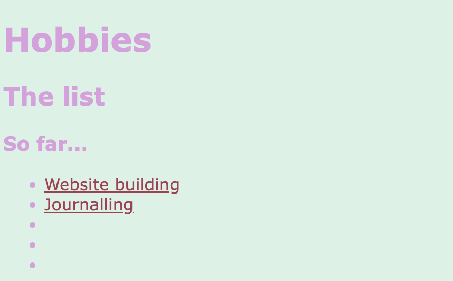
I've been focusing on CSS. I wanted to play around with colour even if it wasn't pretty.
I did some colour swatching for my hobbies page and changing the sizing of images as well as adding alt text.
I took some inspiration from other websites and found a really cute cursor. I'm still looking for an effect I like...
Major success for me as I finally found out how to create a scroll bar! It actually wasn't hard so I feel a bit silly now lol ♥
Shout out to W3 for the scrollbar explanation!!
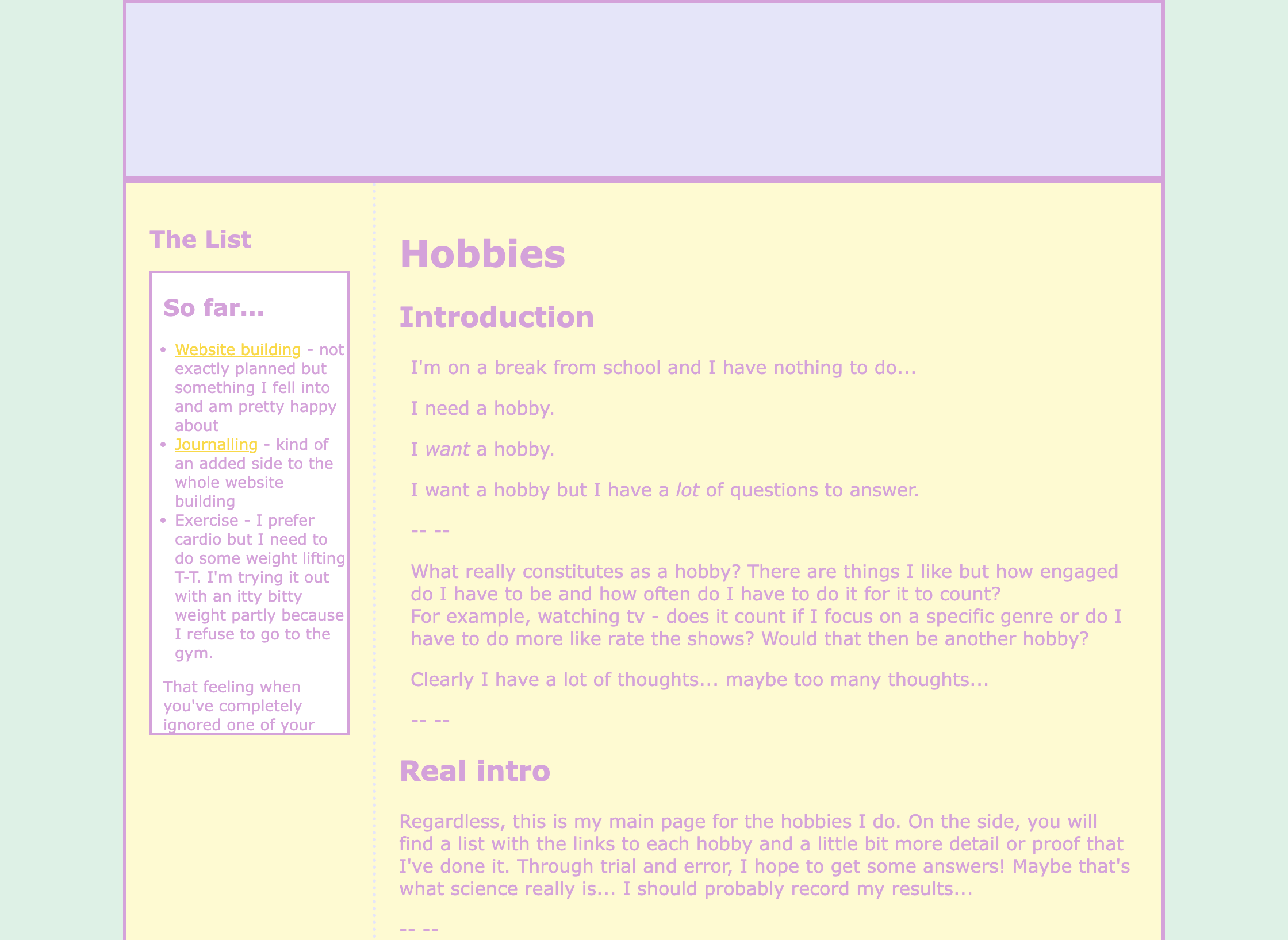
It might take me some time but I really like when other websites have links that aren't in a list but their own little boxes so I'll be super excited when I figure that out. But honestly, I thought I would get tired of this by now so I'm quite happy I haven't.
My webpages are still really ugly though haha
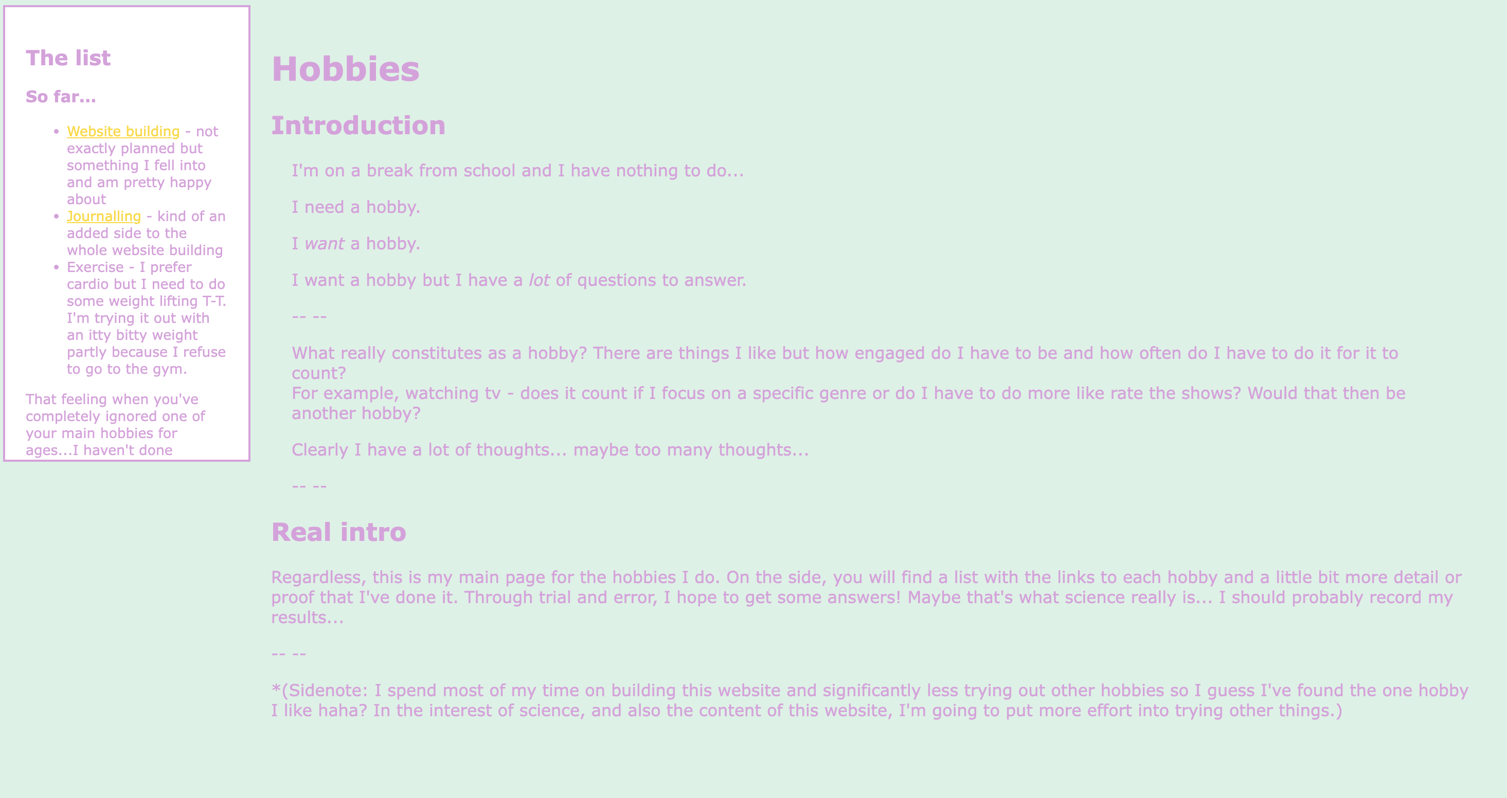
Centered my content in the Hobbies page, created containers and a header.
I wanted to make it look like my homepage but without using SadGrl's template so I've been learning how to create the same format through trial and error as well as using W3. I still use the template to see the where I've gone wrong though. For example, I put the cursor code into the style section and I could NOT figure why it wasn't working until I looked at that other code and realised what I was doing.
I've learnt quite a bit so far but I've still got a while to go. There's a few things I've seen on other people's websites that look really cool and I seriously want.
The chatbox feature is really cool and having buttons instead of links to navigate is something else I really want to figure out.
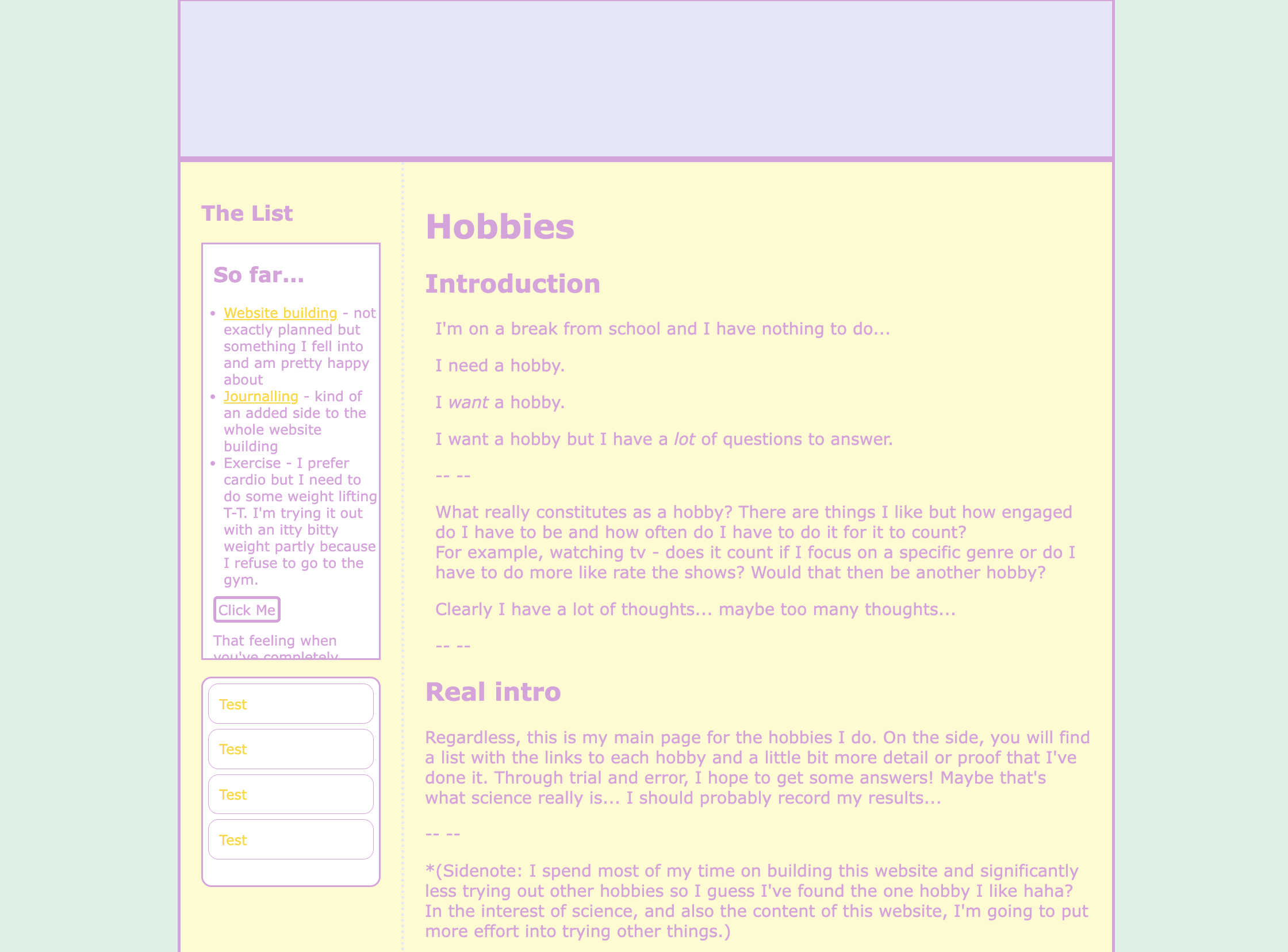
Figured out how to do the button style links in the directory but how do I make it cute T-T - still the overall formatting is done
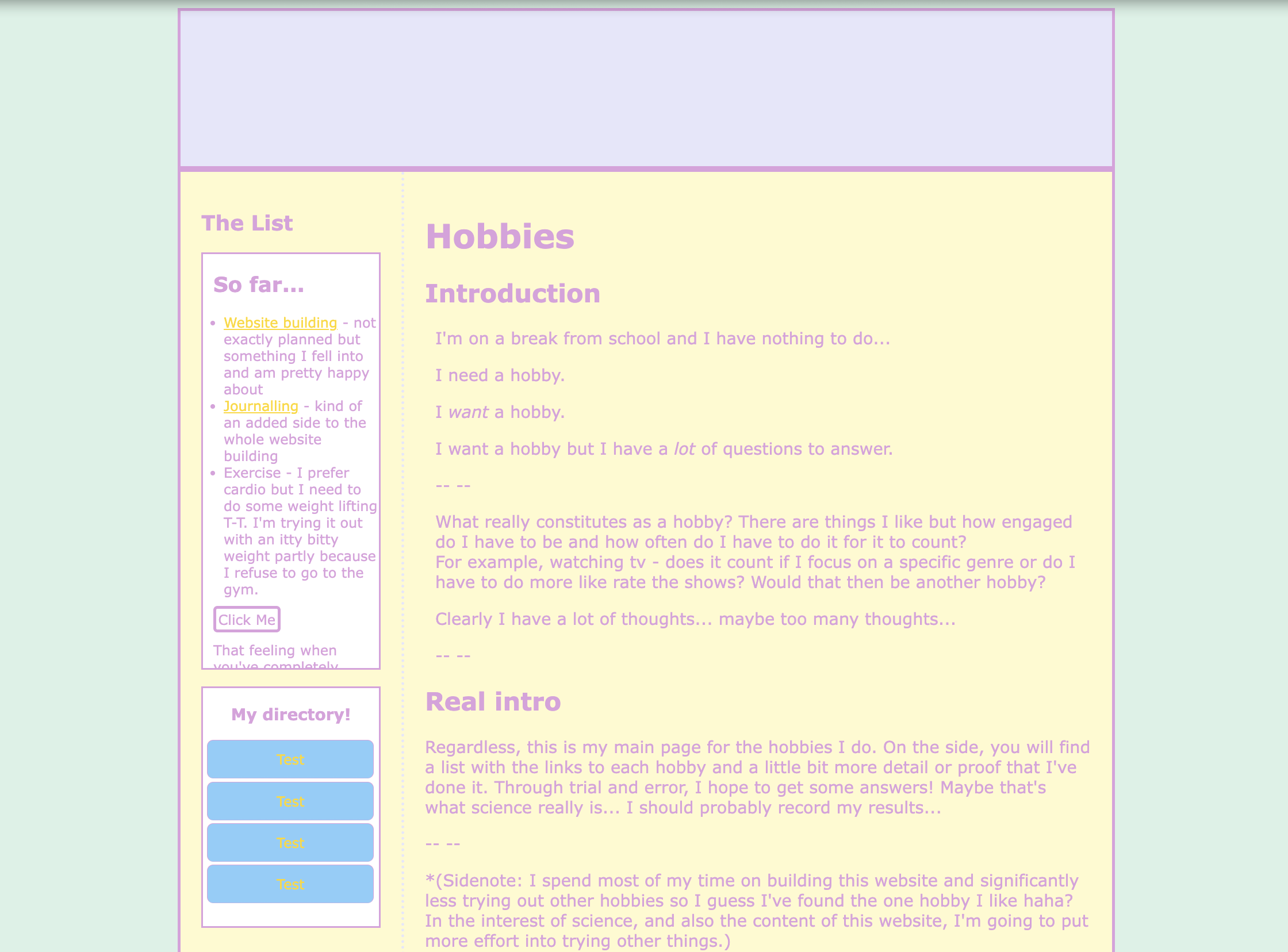
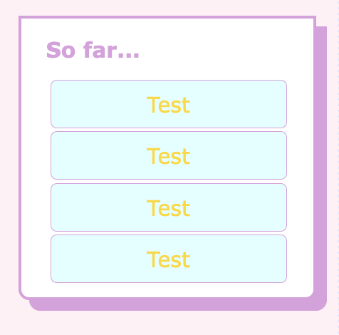
We know have lovely rounded links in blue WITH a gap evenly space
Formatting content into boxes manually is not for the weak or the stupid. I realised wayyy too late that if I didn't set a specific height it would just fit the container -_-
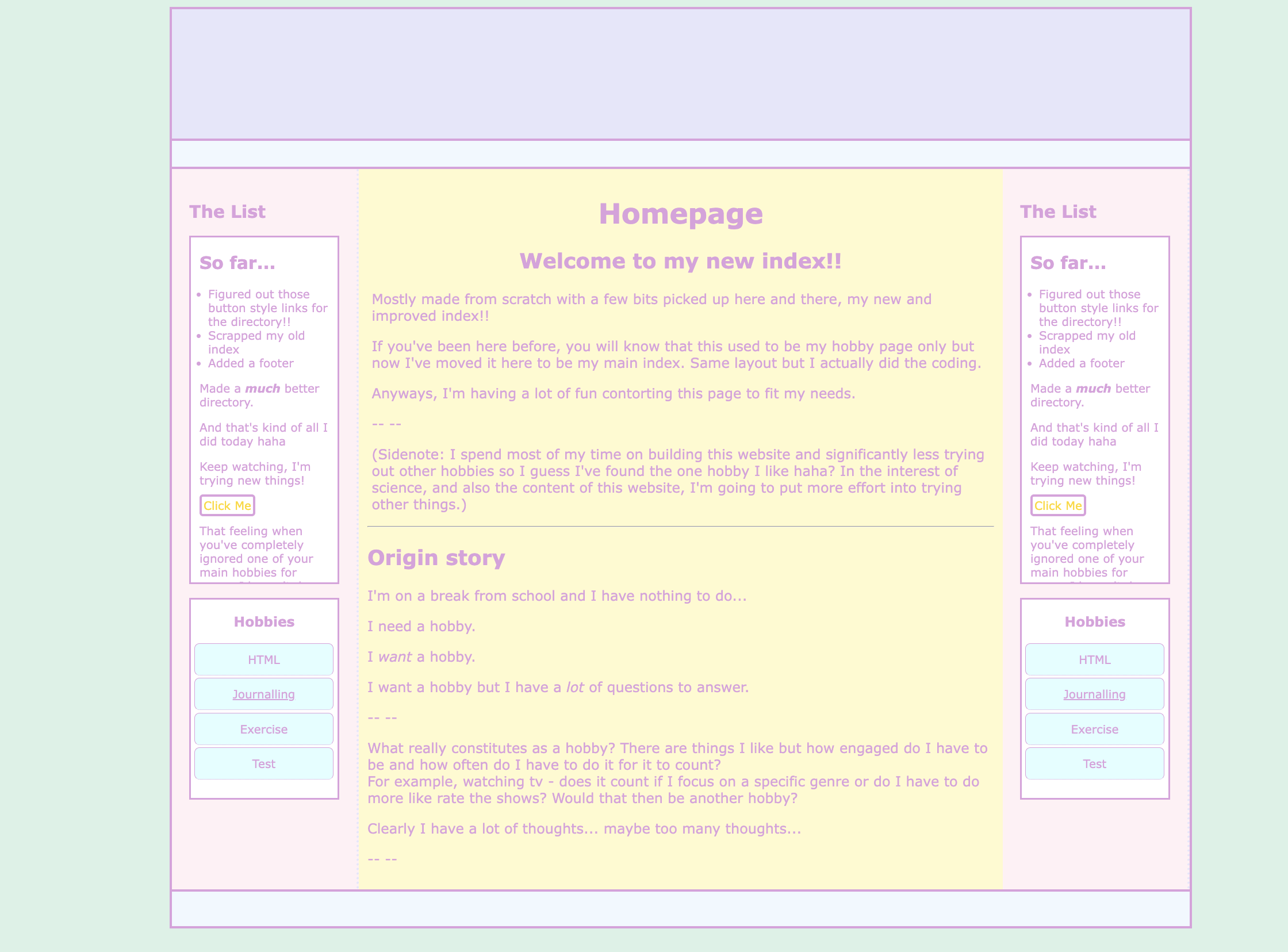
I actually did a lot today: got rid of my old index first, and put in a header, footer, and a right sidebar. Later I also took inspiration (not code) from another website and I made a "floating" box with half the corners rounded.
A lot of other websites I've seen hosted by neocities tend to be more interactive and less static. Sometimes there are polls or chats and there's a lot more movement which is cool. Lots of gifs but also cursor effects or glittery backgrounds, just movement. I saw some with a moving title page or ones where the letters pop up one at a time. Another one had moving text under the header and even a "cd player" that played music.
There is so much I want to tryyy!!
Aesthetic-wise I want to lean into the kawaii colour scheme since I keep getting drawn into those colours and websites. OR maybe have it like a console shape.
Made my main page pop more by adding box shadows.
Updating my goals page and added a colour gradient there and later, in the header of my homepage.
I should have done a before and after...
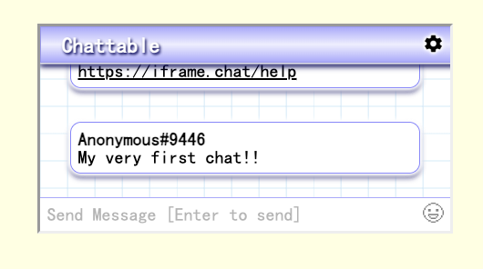
In other news I made 2 template files and put in a chatbox to the homepage.
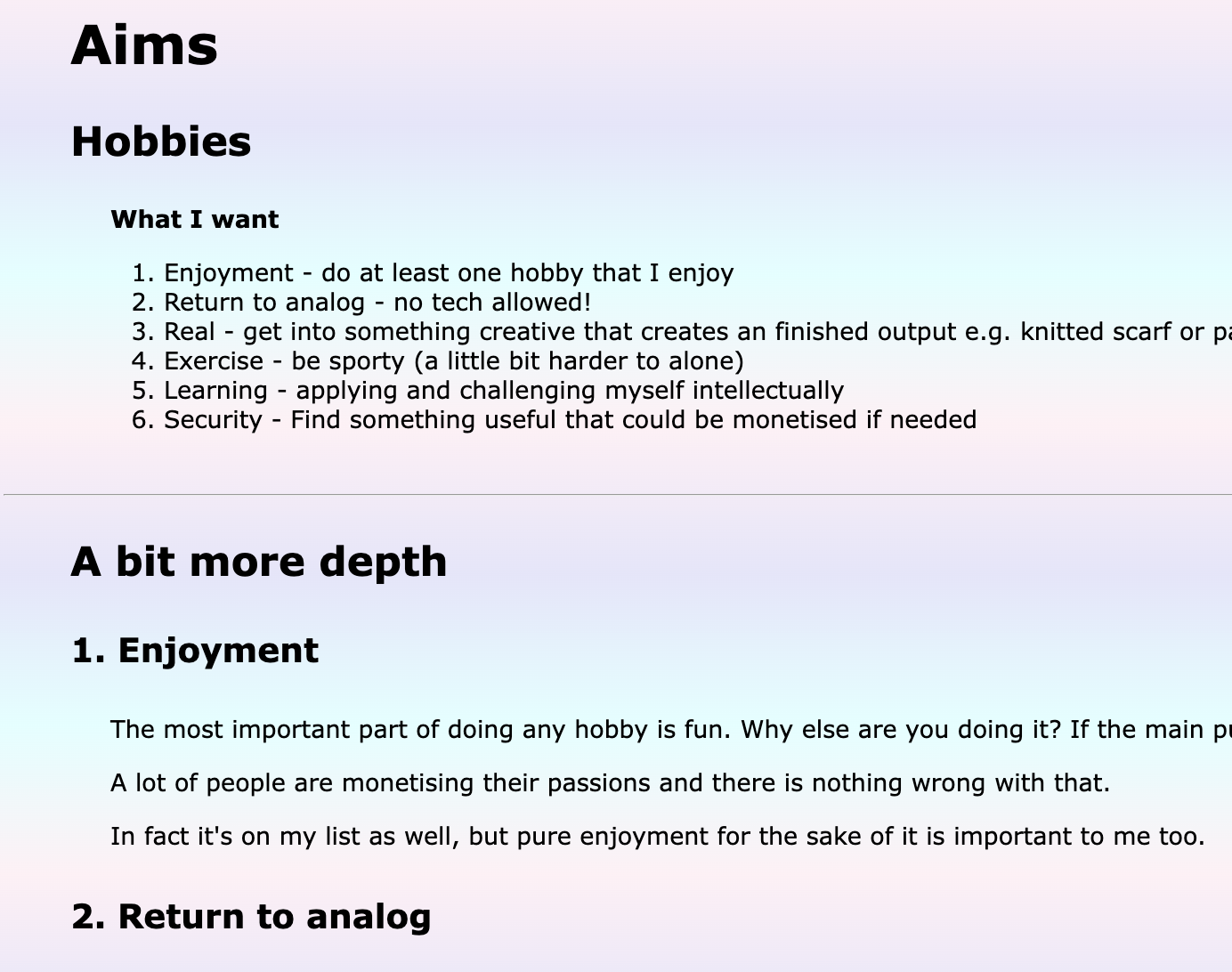
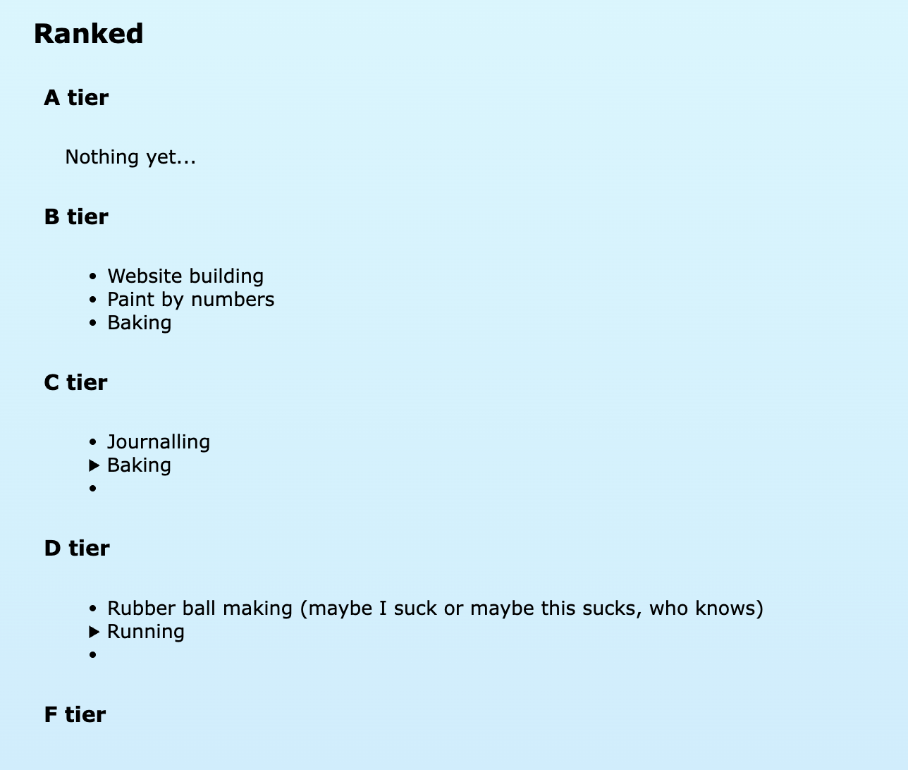
Made two new pages: a proper hobbies list and a proper progress tracker. Minor aesthetic choices made with gradients and a new font.
I used margin left with a negative px to format my details block so that it lines up with the rest of the list. There is probably an easier way to do that...I don't know what it is though.
Favicon, emoji and poll added. Couldn't add a profile picture - it was so ugly I had to delete it. Couldn't add the emoji I wanted either.
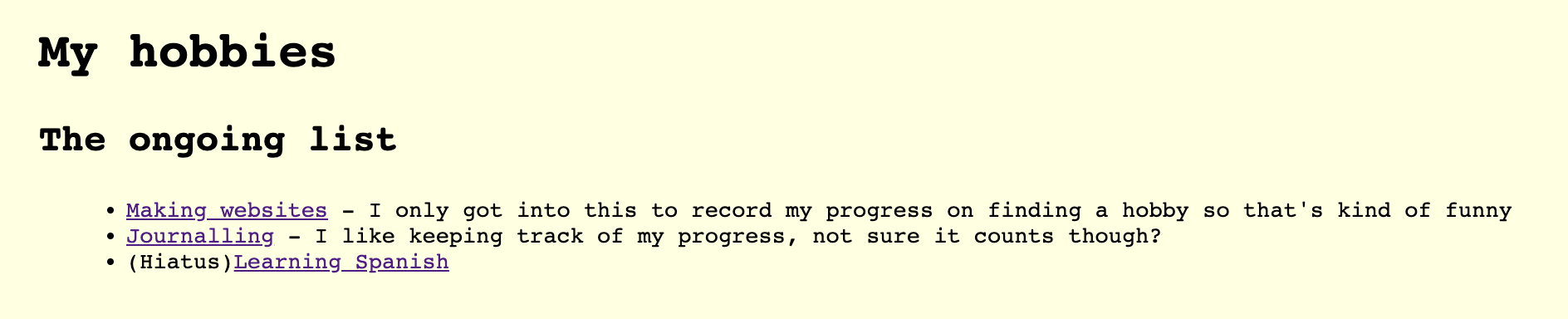
Poll crashed, tried a new one and it was ugly and pollcode.com no longer works.
Couldn't add calendar either which was really frustrating.
Updated my error page but it doesn't actually work?
Added moving text to header and buttons. Did a moving page title but it actually made me nauseous to look at so it's on the trial page.
Removed the buttons because I hated the way they look then I added a status update using petrapixel's widget for statuscafe and imood.
Added (1) cute button back.
Taking a day off. What else should I add to my website? Or what else will make it better?
Nevermind
I went nuts on the layout and I actually did make a before and after!
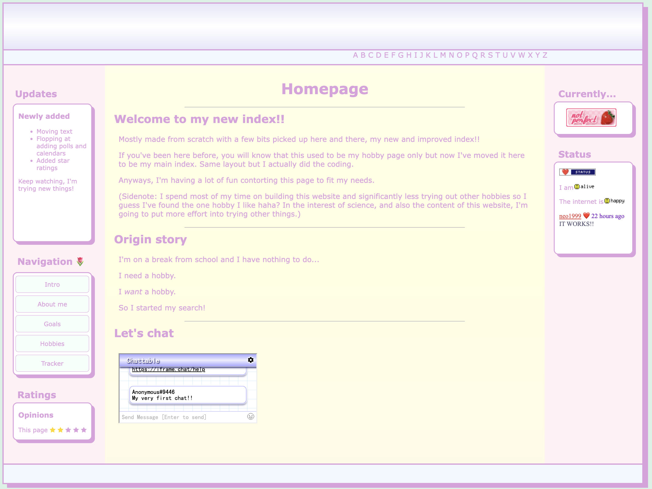
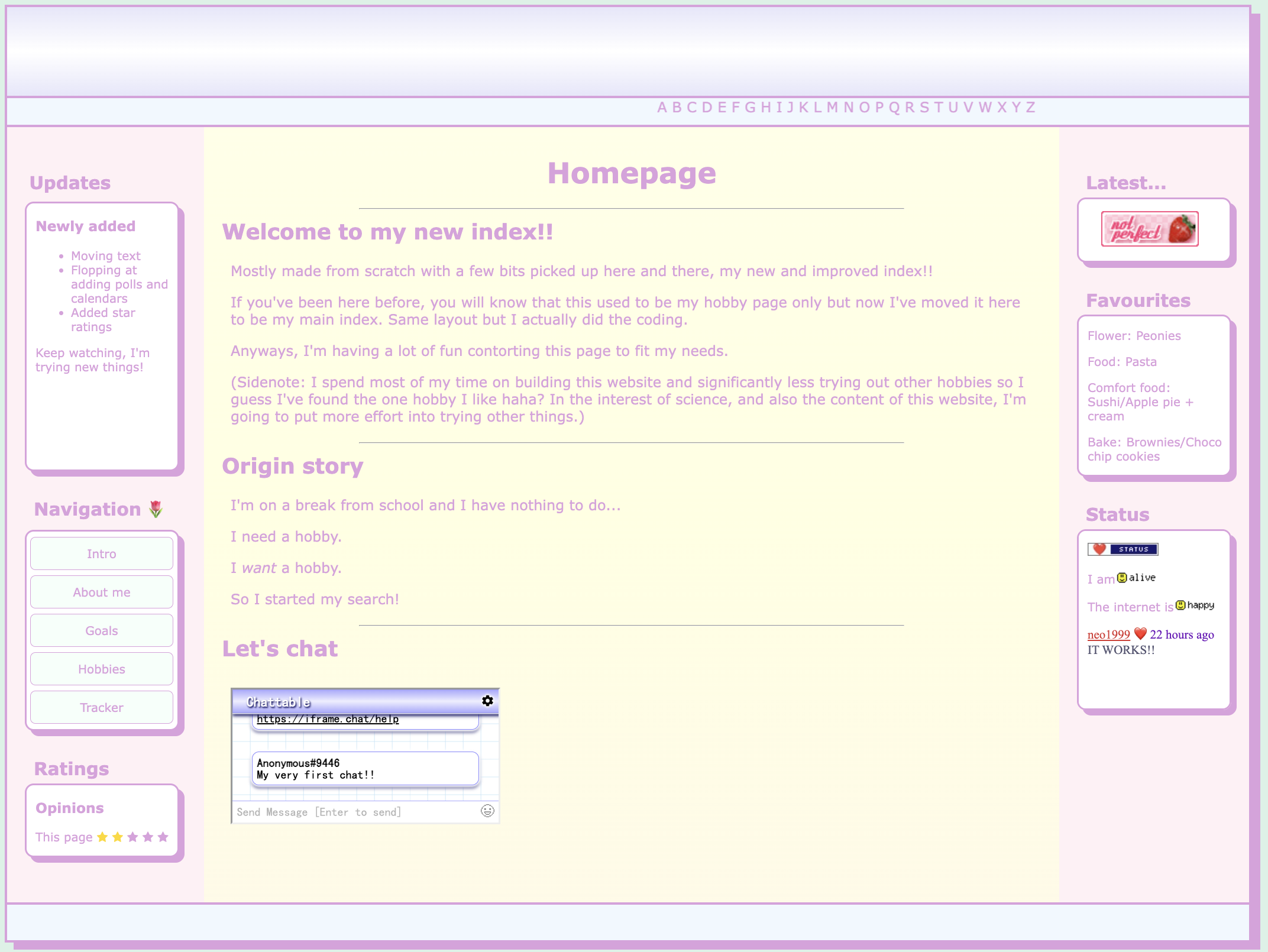

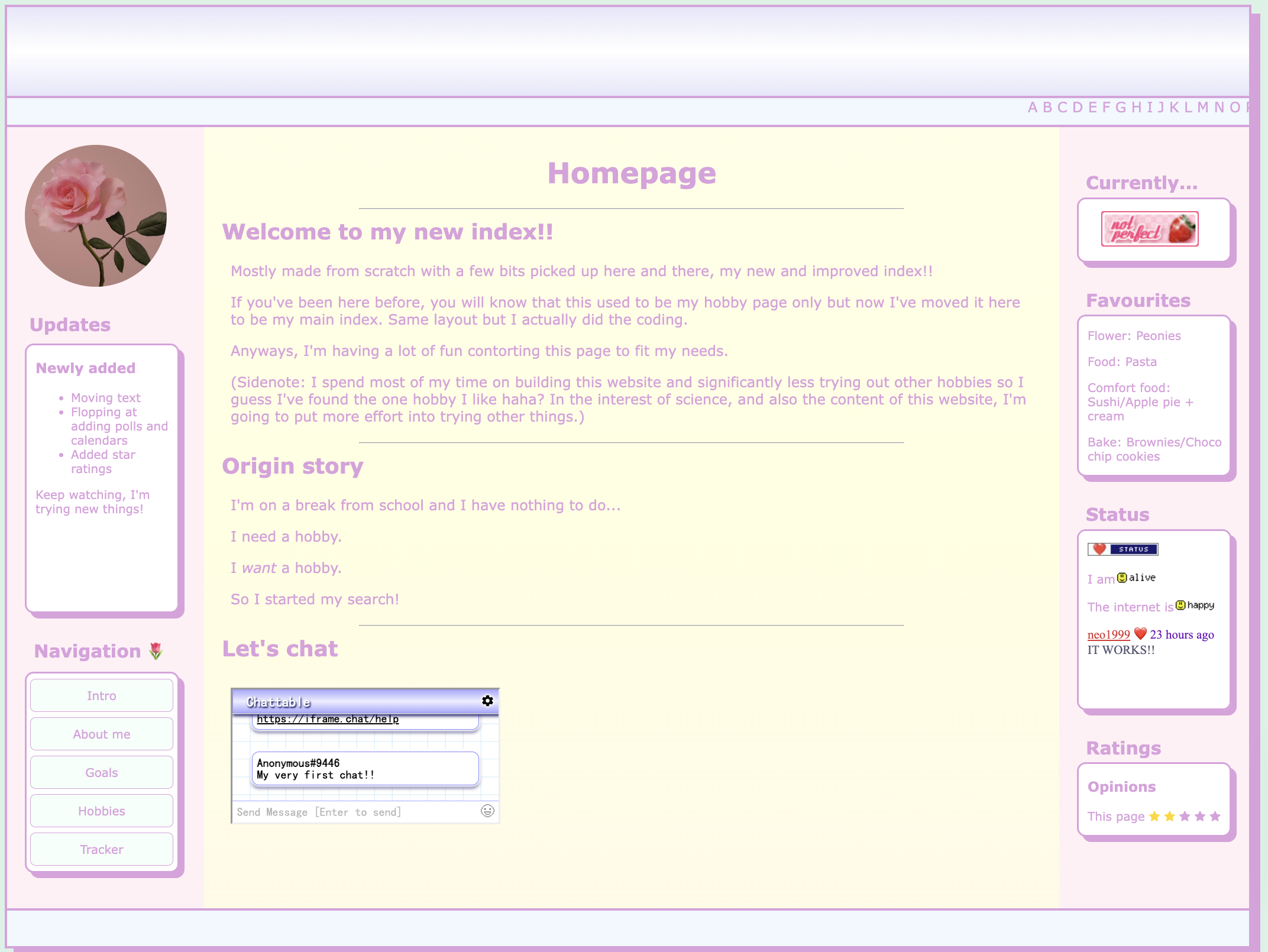
A special shout out to the 7 or so other variations that didn't make the cut and somehow looked even worse
I'm in a special stage of web development where I just want to use every single thing that I have recently learnt and it doesn't look great.
Perhaps one day it will improve - I have a whole separate file which is just index pre-crazy changes
Took most of the day off then I looked at other websites, realised my main section SUCKED and that's why it looks bad and updated my hobbies list.
I've also been working on adding quizzes from "https://www.dragonflycave.com/free-quiz-scripts/#vote"
I keep losing this code?? I wrote it as a comment in another folder and I can't find it anymoreeee.
Added a widgets page and also a games page for funsies. Also created wip folder to organise.
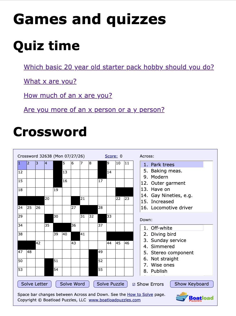
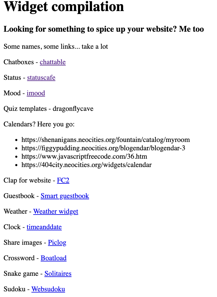
Finished my first quiz - take a look at that! This is basically my updates page - time to rename?
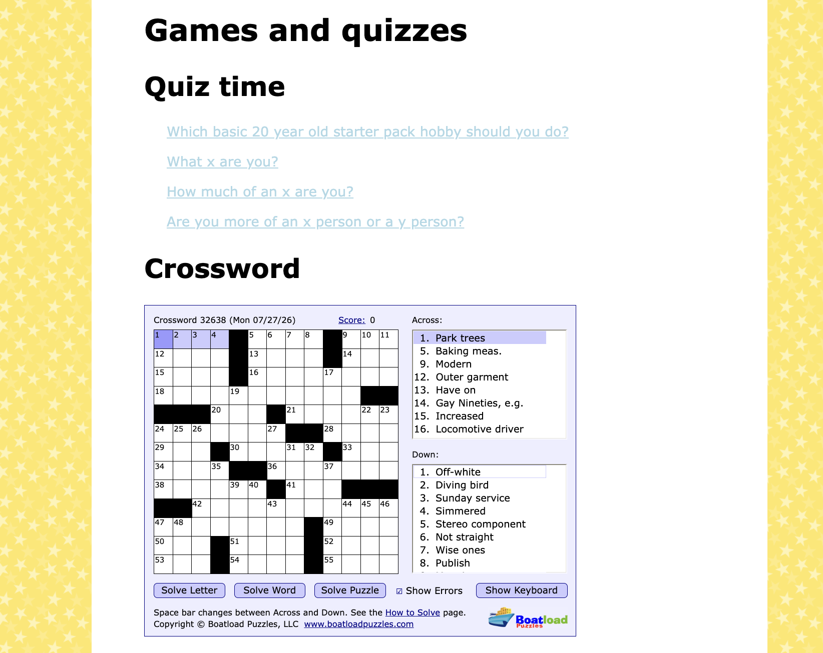
Used Sadgrl's template builder to get moving gif wallpaper for my games page which is super cool.
Random sidenote: why do so many neocities have that one japanese calendar? Can you all read japanese or is it just the vibe? Like what's going on here? It's either that or like 2 other templates I've seen floating around. I want a calendar too.
Anyway, I'm made a image border with the help of solaria.neocities.org/guides and reddit but ended up getting my ip address blocked by web sudoku for accidental querying too often.
No updates
I have come to the astounding realisation that I absolutely despise my index page.
I kept looking at everyone else's page and I really wanted what they had but it's just not me.
There's so much going on all of the time that it's really ugly.
There's still some elements I like but tbh I hate most of it.
It's been scrapped and my save point has been used in it's stead. In addition to that change, I've also made another template where it's one long page with 3 columns, a break and a column. Another layout I'd also like to try out is where it's one column on the left and then two main sections on top of each other. I'm not sure how so I'll probably go check w3schools again because they had a cool tutorial of how to do 3 columns side by side. Pretty cool to be able to do the same thing in so many different ways.
In other news, I'm looking for a word and it's not coming to mind.
It's the hovering popup when you hover over an unknown term on wikipedia. Not a tooltip but like a whole box of text.
I don't actually have an ideas about what to do with my website right now and I've been feeling pressure to update daily but no one's holding me at gunpoint. There's still a lot of things I want to try but I'm incredibly aware that they will take a while to accomplish and even if I do them I won't know where to slot them into my website. Instead I'm just going to try w3school's tutorials and learn new things that way. I did a few way before neocities but it was really boring and I gave up. Now hopefully it'll be less boring because I have motivation: making my website fun and functional. I've gotten up to comments today.
I have straight-up been neglecting this...
Wrote down some ideas for the quizzes and added a clock widget from clockfiddle to my about page
Tfw you realise you can't keep all the cool things on one page :(
Currently I want my about page to look like a physical journal in some ways. For example, the I want the font to look hand written or done on a typewriter. I want the pictures to look like they are stuck with actual tape and have a dynamic layout. I might draw up a mockup for the format. At the minute I am still deciding how I want the tabs to be laid out: vertical, horizontal, full-page etc.
Dimden has an online photo album that's really cool and I want to make one myself with a corkboard background or as if the photos are clipped onto a clothing line of some sorts. For the former it would be hard to put too much on it so maybe a smaller version of it for like an electic entry page or maybe an ideas/vision board type page. The latter could be really fun depending on the background like if it was following a path that you follow by scrolling horizontally. Another idea was a map layout like an interactive city with different things happening in different places. For example, you click onto the restaurant and and you look at a menu then depending on what you click you get different images of foods.
Upsides = really fun. Downsides = really hard for me to do as a beginner.
Food for thought regardless
Learnt to add another tab to the about me page and ended up looking for inspo for the journal-like webpage. Then realised the layouts would be cool for a regular webpage as well. Made a mockup for the sort of photo album I think would look cool on miro (online whiteboard). Started on a corkboard style too. I think that would be ultra cool for an about me section. I might get rid of the tabs tbh bc I have a different picture in my mind. Or maybe I should do tabs going down like a navigation that is outside the journal design? It's making me want an ipad because I know this would look amazing using a stylus. Just had an awesome idea: the background is a a room. You click onto the desk to see the items like the about me page as a journal and above that is a corkboard vision board.
My ideas are above my skill level but we move. Ooh!!! On the desk it would be so cool if there was a pencil case and a pen and a rubber that all mean different things when you click or hover on them. If the desk had items like books I've read recently and the photo album as well as a clock. The creative juices are flowinggg
And another idea: what about a computer and you have to log in (password is written on a note on the computer).
For the corkboard it can be a mix of things like a wishlist, to do list, random pics etc. to really give off the right vibes. Somewhere I want flashing colourful fairy lights. Maybe a calendar somewhere in this "room" and receipts from my fav places.
I don't actually want to lean in too heavy on a room concept so maybe an about me corkboard and journal on hobbies with a separate city/map for the photos. Then the other stuff can fit in somewhere else or get scrapped.
Honestly super tempted to make the corkboard look like that one meme of the dude looking wild with the red string looking at conspiracy boards.
Boom another idea: have images on the corkboard overlay using stack overflow code and then try to be able to click on images to get a closeup of it or get directed to the relevant tab in the about me book.
Today has basically been idea and mockup day.


I'm thinking champion island and paris games as the inspo for my map but it's way too complex so if anyone else does it let me know because I want to see.
Right now, I am working on the corkboard. I decided to try out some code from stackoverflow for a vision board-esque effect.
I'm so utterly frustrated with making this image fit, it is laughable. Why can't it just fit like it makes sense?
Made yet another mockup of my about page and I realised that if I was less ambitious it might work. Unfortunately, or perhaps fortunately, I am not so I will try my own bloody patience trying to make it do what I want.
Genuinely, what an absolute nightmare is this concept. Why won't this board just be a board.
I had to separate this image into 2 elements: the background and the the border. It looks better scale wise but a little ugly picture wise.
It's actually looking a lot better after I centered it - I just need to figure out what's going on with this border and add images properly.

Every day I get closer and closer to my mental image of what exactly it should look like and that's beautiful really.

Nevermind...just got 502 bad gateway'd for my entire site apparently what the heck. On the upside, finally figured out how to display one and only 1 tab when you first enter the page. Thank you display NONE. That's what I call progress.
Last bit I did after 12:00am but I added a picture to my corkboard. It looks incredibly out of place.
Once again, I am sacrificing current cool for the vision of a concept that has yet come to be. In other words, my about page looks fugly but it's in its ugly duckling stage. Let's see what will win out in the end: the original concept or the path that my changes end up following despite my wants.
In other news, my index refuses to be edited for some reason. No matter what I change it doesn't occur on screen. Doesn't seem to be an issue on my side....and now it works. Okay then!
Decided to accept change and use the current cool for my about page and add some new tabs as well.
I had some new journal ideas I wanted to write about.
I ended up removing some tabs to because who really cares about my to do list or routines except stalkers?
This might be my digital diary but internet safety is important.
Added an entry to progress tracker too.
Absolute depression. Not only has someone else done my journal idea wayyyy before me, they made it so cute that I can't even be mad.
Kkul.store I promise I did NOT copy you.
I AM STUPID
While looking at other templates for my website, I realised that my problem with my tabs and page not lining up could be fixed so easily. Criminally easily (maybe) by using the aside and main elements. Why am I like this? Sidenote making a blog page courtesy of itinerae's lovely layout.
I'm so close to a solution I'm acting like Curt Connors.
Apparently I am a moron because yes I did need a container and a main and an aside. Once again Sadgrl's template builder came in clutch.
I really need to learn how to do this on my own next time cos this is getting embarassing.
Regardless, I'm getting closer to my original vision.
Update: tried to change the formatting of the code (not even the actual website), accidentally ruined the format completely and had to undo everything I did in the first place. It did, however, fix my issue of being unable to change the look of the tabs. I don't know what happened? but it worked out so whatever ig
My tabs have individual colours now!!! I have no idea why I was overthinking the code. Literally such a simple solution - thank you random reddit user who said "Just use css" because yeah just do the thing. I kept trying to make divs to make separate tabs like a silly billy when I just needed to style them in the buttom element.
It no longer changes colour on hover or when clicked but that's an issue for another day.
MAJOR UPDATE: I have been wanting to have the displayed tab or the "first page" be the cover of closed book and then the rest of the tabs be two pages but I couldn't figure it out. BUT I have now! I'm using two html docs: one file for the entry page and then another for the actual workable journal. Thank you random reddit user - life is lwk about think less sometimes.
One day, I'll work on having two pages for each tab by creating another aside within the container but just know this means so much to me!!!
Ooh!! Had an idea - a popup asking if you really definitely want to see my super secret hidden diary that looks like one of my buttons. I know which one. It will be fab.
What goes up must come down. I use 80% zoom on my computer so often that I've formatted all my pages that way... it looks weird to everyone else because it isn't responsive T-T
The time has finally come for me to really learn javascript. I didn't actually really learn css or html but tbh you only need to learn the basics and play around with what you know most of the time. Even if I don't know, there's some template out there I can use instead. That's probably a bad way to view this but the thing about hobbies is that you can put as much or as little effort in as you'd like which brings me back to my original statement. I'm learning js. You can't really cobble together stuff with javascript since it's a bit more structured than css or html so for things to actually function (e.g. my long awaited theme switcher), I'll have to put a bit more effort in.
Updated my about and blog pages and I might make an OCs page. New hobby unlocked haha
Just updated index so it fits an 90%-100% zoom rather than 80% so the movement from that to the about page is less jarring
Mainly focusing on formatting today since I've been trying (and failing) to integrate the colours I like into my index. I honestly started out with pastels because they are easy to match with each other so I may have to change completely to get a nicer, more sophisticated look.
Also I am working on my blog page which, like my "potential page" seems very blue. I think I tend to gravitate around blues in my daily life too.
When onto my progress tracker with very little progress and changed it so the index will take you to the sections and turn gold when the links are hovered on with no other text-decoration. I had to look at another page because I actually forgot how to do that haha
It is also a lot harder than you might think to get a background image to suitably fit a page.
After checking my to do list I realised I have done or can do multiple things on there e.g add images, gifs, have an entry page, have an about page, add a lace border. Then I realised I had completely forgot about some (cough cough calendar cough cough) and forgot what some others even were - poor blogroll.
May add some new things to do to it.
It's been just over a month since I started. Obviously I haven't worked on this website every day like I did at the beginning but I'm just so happy that I managed to get a decent website up and running.
Today, I'm mainly trying to work on making a theme changer button.
I did in fact manage to make a theme changer button and it did in fact infuriate me.
I looked at a lot of different codes and gave them a whirl which was fine and whatever but I wanted to make my own one with a dropdown that would change the theme depending on the value. It currently works but it also needs a button to submit it before it changes which pisses me off and I will be working more on changing it so that the theme changes with the dropdown selection alone. I do not know javascript so I literally just took whatever I knew and ran with it which was not much. I combined the html selection with the switch for javascript which I used for the very first time and was incredibly irritated with. The main issues was I was trying to set var x to whatever the dropdown value was but it kept taking the default and somehow a button fixed that and idek why. There really comes a point in every individual life where trial and error is the name of the game. I looked at other pages to see if they were doing something like I was doing but genuinely everyone is using buttons or toggles instead of actual dropdowns which is probably a clue that it doesn't work but never say never.
UPDATE (literally less than a minute later): IT WORKS and all I had to do was put in the onchange="changer()" (which is my function) to the select element.
Super happy with that and everything turned out great! I had most of the code down I just had yet to discover the onchange attribute and how to apply it.
Also added two new updates to my blog as well.
I tried a new (old) hobby today and updated the relevant pages. May also add a blog later.
New blogs available on my page. Also added some detail to the side panel. Updated the relevant hobby pages because I am actually doing things now haha.
People who should in fact keep their mouths shut include me, myself and I. I got excited too early. I didn't do a single hobby today because I had to other adult things which is disappointing in general, but I am also disappointed in myself for not showing up for myself. I'll try again tomorrow but my younger cousins are coming over and they are 13 and 6 respectively so I doubt I'll have much time to myself.
UPDATE: I managed to lock in and finish the chapter excluding the exercises so I'll try and do them tomorrow.
I can't believe I accidentally guilt-tripped myself into doing my hobbies (chapter of french and a bit of BSL but not a whole section).
Double update: Updated my blog too as well as the about me page. I think I might just work better towards the night.
Updated my blog
Tried out a new hobby (or interest?) by learning about perfumes firsthand and updated my about me, blog, and hobby list pages.
I'm trying to figure out what else to do other than work on the aesthetics of my websites. I want a website button eventually but right now I'm trying to figure out how to have a section with left and right buttons. (see below)

A carousel of content is what I'm calling it. I want it on my potential page and I'm working on that for now since I don't have anything particular to add to it.
Mini update: carousel is in fact the name, or to any other person, a slideshow. My mind is ?/?#•?€ for connections.
Ignoring the carousel for the time being because I actually read the js for the clock widget and I'm going to play around with the formatting. I ended up actually editing the potential page for once and added the calendar where a picture used to go. It might look a little chunky though? I did find a place to put my buttons!! It would be really cute if I had a drawer that you clicked on that opened to show buttons instead but I cannot do that.
Added a random weather forecast to my blog page for the love of the game. It's right at the bottom as well.
Also changed the calendar to fit the colours of the potential page.
Just about still 14th at 23:57: I want to make a website for my future micro bakery because hotplate needs one for planned drops.
I feel like I only ever updated my blog and hobbies pages now. Farewell front-end web development, you were fun for a while.
Not updating as often because I actually got a social life. Insane I know. Anyway, tried Ultimate Frisbee, sucked at it and updated my relevant hobby pages. Also realised I should never impulse buy because I spent way too much for a skateboard I never use. Also updated about me but might un-update it too because why am I posting so much information on the internet?
Need to work on 2 things: carousel for potential page + designing a website button. Might change name too?
Made a new page and used my theme changer!!
It's been a while since I've made any major updates.
I have also realised this whole page is less about hobbies and more about personal progression. I think hobbies were just the first thing I recognised that I needed to improve on.